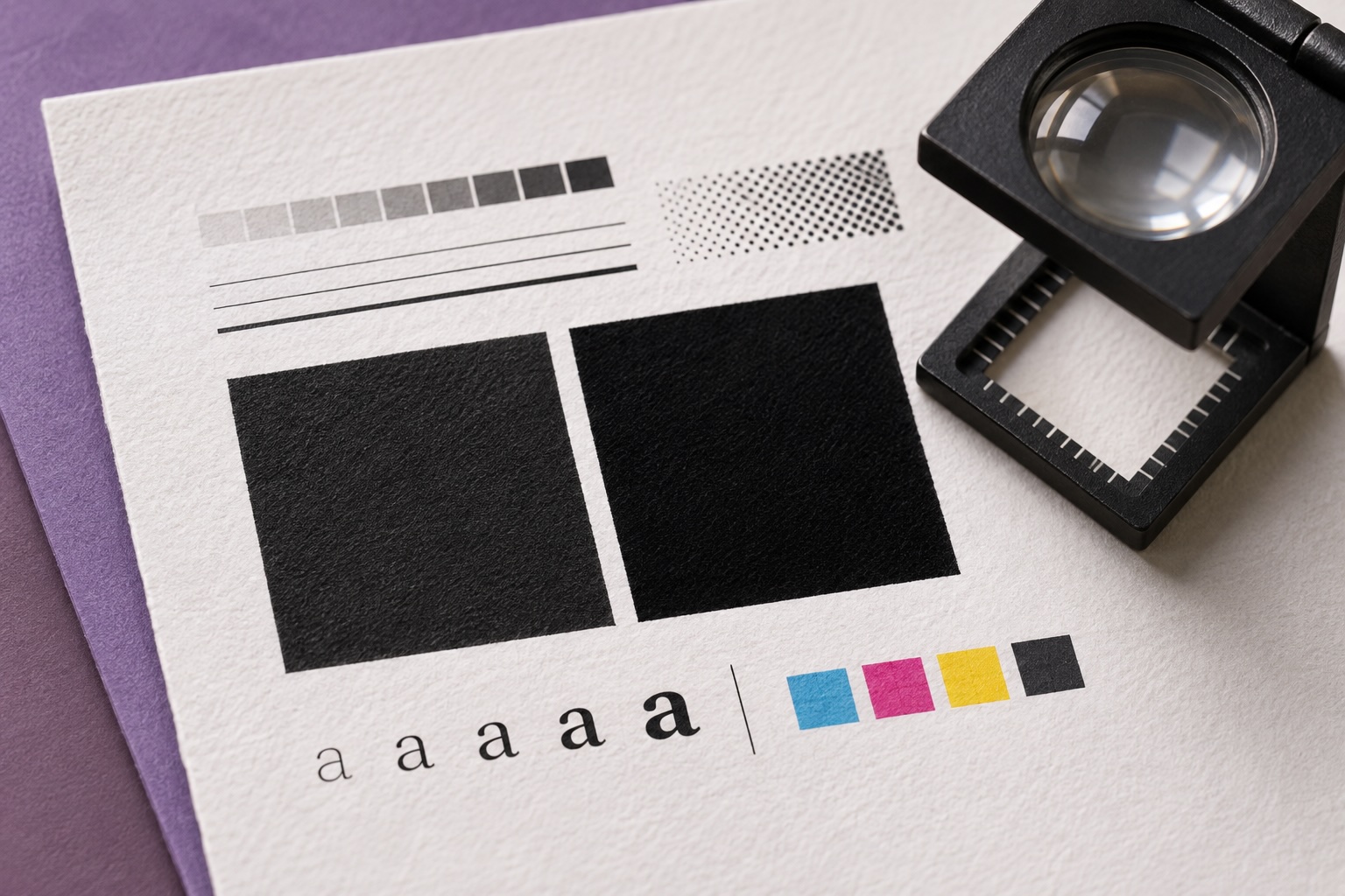
Two blacks can look nearly identical on screen and behave differently on press. Small text set in black ink alone avoids the need to align several ink plates along each letter edge. A large background may benefit from a richer black built with additional inks, depending on the printing process and the paper.
A rich black mix should come from the print provider’s specifications. A recipe that works for one job may put too much ink on another stock. Before sending a PDF, use separation preview to check that small black text appears on the intended plate and that large dark areas use the agreed build.
Give extra attention to small white text reversed out of a dark background. A proof can help show whether the letterforms hold up at their final size. The right black depends on whether the job calls for a crisp edge, a deep field of color or both.