
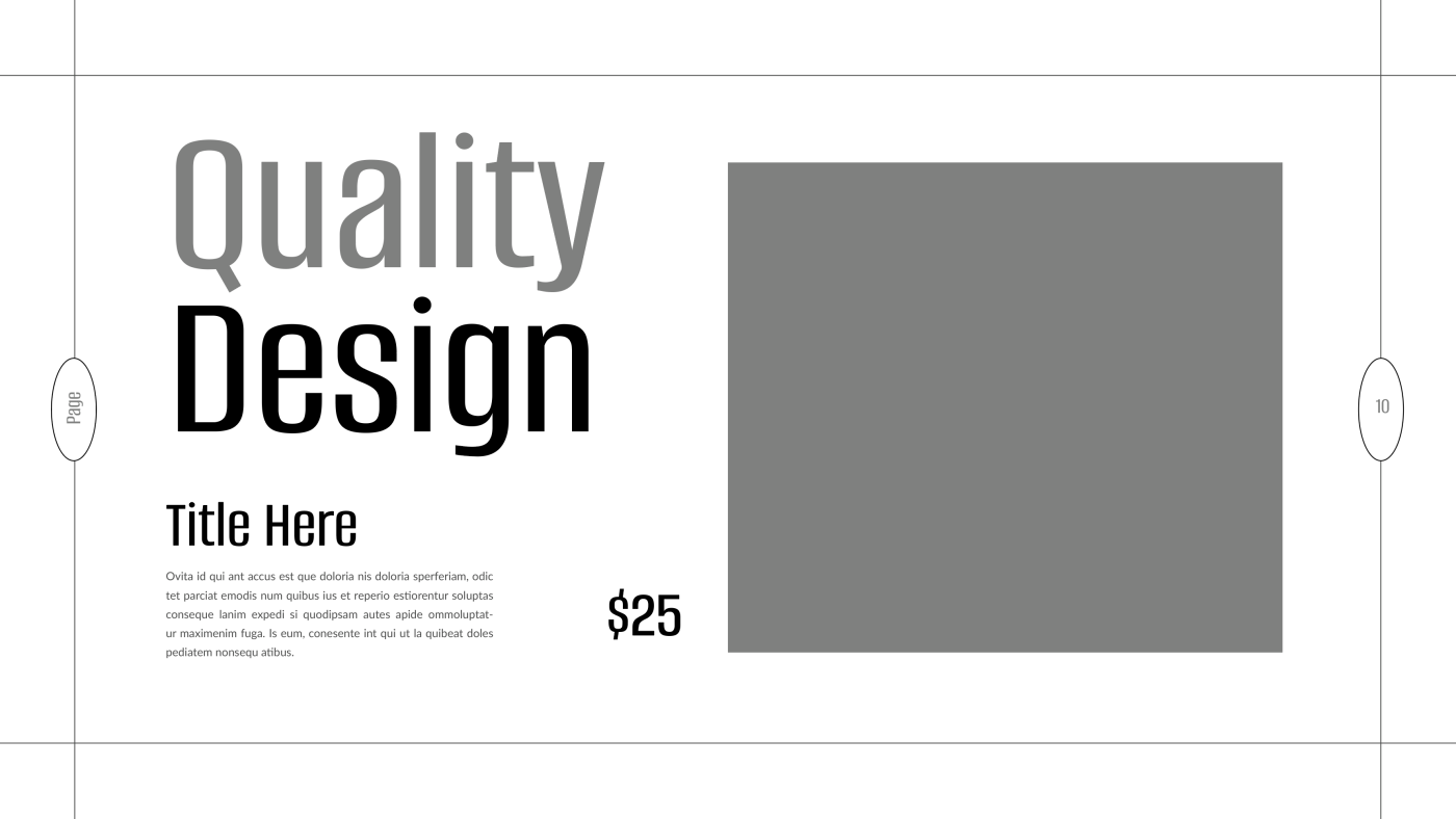
Visual hierarchy is one of the most critical principles in typography — and in design overall. It’s how you guide the viewer’s eyes from one piece of information to the next, in the order you want them to read it.
When designers neglect hierarchy, users are left confused, unsure of where to start or what matters most. A layout without hierarchy feels flat, noisy, or overwhelming.
What is Visual Hierarchy?
Visual hierarchy is the arrangement and styling of text elements to indicate their relative importance. You use size, weight, color, spacing, and positioning to create a reading path for the viewer.
Think of it as storytelling with type — you lead people through a narrative.
Key Ways to Create Hierarchy:
-
Font Size – Headlines should be larger than subheadings, and subheadings larger than body text.
-
Font Weight – Use bold text to highlight key elements, but avoid overusing it.
-
Color & Contrast – Important elements often have higher contrast or a distinct color.
-
Spacing – Add more space above and below major sections to break up content logically.
-
Positioning – Place primary messages near the top or center where users naturally look first.
Visual hierarchy makes your typography readable, scannable, and purposeful. Without it, even beautiful fonts fail to communicate effectively.